ART-in-Education
C.S. Poppenga
Artist in Residence
Wallowa Elementary, Wallowa, Oregon
In April 2010, I was an Artist-in-Residence for one week at Wallowa Elementary in Wallowa, Oregon (USA) located at the foot of the Wallowa Mountains.
Grades Kindergarten through 5th participated, bringing the total number of students to 120.
The mural theme, "impressions of the local landscape", was essentially selected by the students. The first day of the residency consisted of classroom discussions in which the students also brainstormed for elements (animals, buildings, people, etc) to include within the context of the landscape.
The final mural size was approximately 7 ft high by 24 ft. As with all my residencies, I place as few marks as possible so that the final result is the students' work.
BELOW:
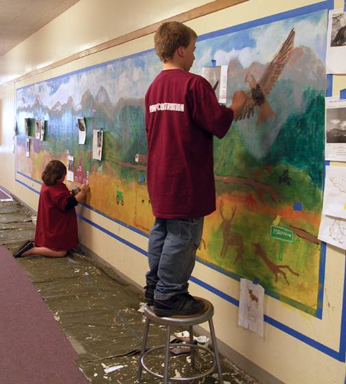
The initial layout and block-in of general shapes/colors was accomplished during the second day of the residency.
The blue outline is the taped off edge; by the end of the week a border was added beyond where the tape had been.
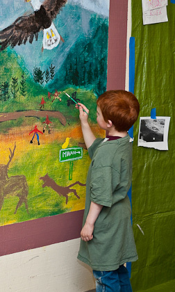
It was very apparent that these students have a personal and knowledgeable relationship with the mountainous environment in which they live. The first day painting session was exciting to watch as the students freely created their mountain landscape.





BELOW:
The mural completed on the final day! With only a four-day week and using the first day for brainstorming and image research, the students were able to complete this mural in three days! As with most works of this type, the mural is actually "open-ended", meaning that students could continue adding to the imagery over time if their teachers want them to.
Because of the difficulty photographing a mural this size in a hallway, I shot several "blocks" of it and then merged the photos on a computer program. That is why there appears to be a bend in the mural and some of the "stitched" sections of the photos show up. Still, the result gives a good indication of how this mural looks.
LEFT:
Students collaborated on several elements of the mural. Some blocked in subjects that other students later added to. Here is that method in-progress with one of the eagles and (in the background) the image of the school building.
RIGHT:
Student adding details to the "hunters" portrayed on the mural's far right.
ABOVE:
Offering guidance to a student who is adding magpies to the mural. She has already painted in one magpie in the tree above the red school house.

ABOVE:
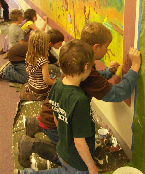
I solved the issue of a large, high energy Kindergarden class by having six volunteer 5th Graders each mentor individual kindergarders. This worked great! In this photo the older students "map out" the contour of the object to be painted and then the kindergardener completes the painting under the guidance of the "mentor". It was fun to hear how carefully and completely the 5th Graders instructed. This process was very productive on several levels and the older students gained a valuable experience.
RIGHT:
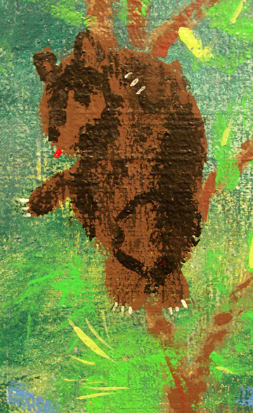
One of everyone's favorite parts of the mural is the bear up the tree.
Three students collaborated to produce this critter. The first student blocked in the basic brown bear shape. A second student added the dark brown defining areas. And the final student added claws and a red tongue
BELOW:
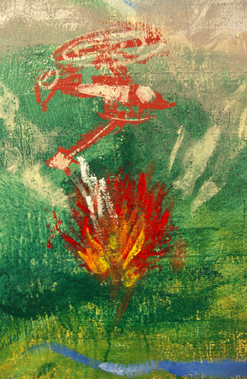
Students were knowledgeable of their area's evironmental history and so wanted to include a forest fire and firefighting heliocopter, A plane using a water bucket was also included on the mural's far left.
ABOVE:
Rafting on the nearby river! This served to instruct students about "less is more". Only the bare minimum is used to convey the suggestion of red rafts, yellow lifevest-clad riders and turbulent water.
ABOVE:
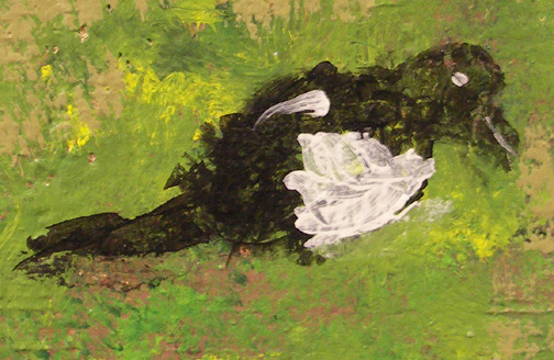
Detail showing one of the magpies (this one is in a tree.) The rough surface on which the mural was painted encouraged students to be free in their mark-making and think more about shapes rather than line.
ABOVE:
Detail showing a snowmobiler. After the student brought the image to this stage, I encouraged him to consider it's merits and whether or not is was complete or required more marks. It was determined (and several other students concurred) that is was indeed finished. It has a powerful energy in it's simplicity.
BELOW:
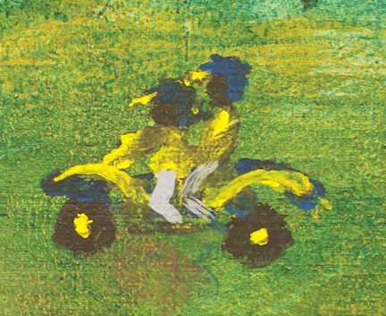
Detail showing a dirt bike with two riders.
BELOW:
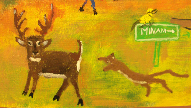
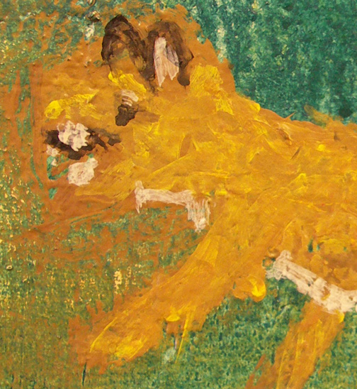
Detail that is a great example of how an image can evolve from a mass of color. Contour lines are not drawn in and the color alone creates the form of this mountain lion. This method is in contrast to the mountain lion (above, right) attacking the deer.
ABOVE:
Students wanted to show the life/death struggle of the natural environment. Their teachers said "No Blood" and so it was agreed that the act could be implied.
ABOVE:
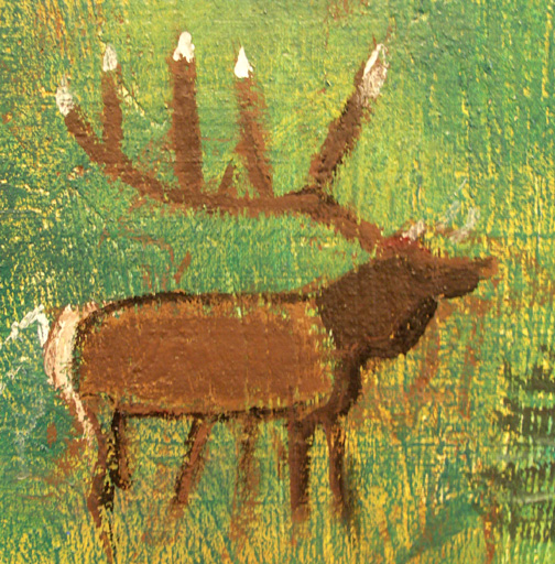
A nicely formed elk (with, no doubt, a world record rack!)
As with all the photos on this page, notice the texture of the wall surface and how it impacted the manner of painting.
ABOVE:
I include this detail to emphasize the beautiful color overlays that were achieved in this mural. Here you see a tapestry of greens, browns, ochres and blues that are suggestive of metal patinas such as some bronzes.
ABOVE:
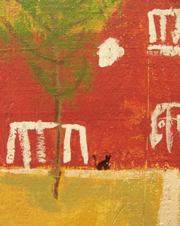
My imagery contribution to this mural, is a tiny portrayal of Canuck, my black cat who passed away in December 2009 (age about 25)
This is an interesting "blow apart" depiction.
Side view . Line alone suggests mass.
Side view . Very angular, suggesting harsh texture
Side view . Fluid line.
Side view . Precision of line placement.
Side view . This is what one might label an "intuitive drawing."
Side view . Again, precision of line placement.
Side view . The erasures add a textural quality that works well with the drawing.
ABOVE:
Front views.
Note the differences in quality of line and placement.
Side view combined with what appears to be a top or front view. Abstract quality.
Side view . This has a "T-Rex" feel to it, which was unintentional but makes for an interesting interpretation of the horse skull.
BELOW:
One session with the kindergardeners was spent drawing from an actual complete horse skull I often use in my drawing workshops. It's an object the students do not see every day and so it causes them to spend more quality observation time while drawing. Below are some of the drawings the students produced.
Click on each image to see it enlarged.


